© Filip Dujardin
© Filip Vervaet
© Filip Dujardin
© Filip Dujardin
© Manor Grunewald
© Filip Dujardin
© Filip Dujardin
© Filip Dujardin


© Filip Dujardin

© Filip Dujardin
© Manor Grunewald
© Filip Dujardin
© Filip Dujardin
© Filip Dujardin
© Filip Dujardin
© Filip Dujardin
© Manor Grunewald
© Filip Dujardin
© Filip Dujardin
© Filip Dujardin
© Filip Dujardin
Arcade, 2021 - with Filip Vervaet & Manor Grunewald
A constellation of works by Filip Vervaet, Theo De Meyer, Manor Grunewald
Arcade #1
A first collaboration that lies somewhere between installation / architecture / scenography / intervention in space and performative sculpture.
—
On Kitsch
by Bart Decroos
At the end of the summer of 2021, I was invited to go see the exhibition Arcade, in which the work of Filip Vervaet, Theo De Meyer and Manor Grunewald was shown, and which took place in a large greenhouse somewhere in the peripheral countryside around the city of Ghent. On my way to the exhibition, on a sunny afternoon, I stepped off the train at a small and nondescript station, from where I had to walk twenty minutes to the former agricultural site on which the greenhouse was located – a walk that would prove to be a very fitting introduction to what I was about to visit.
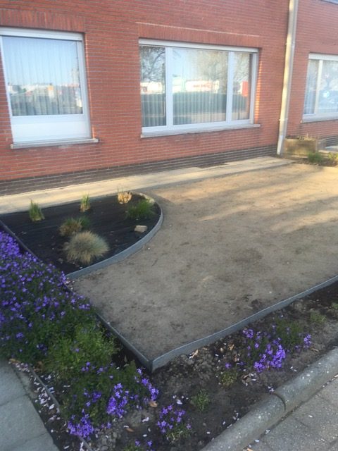
The walk took me through a piece of that typical, rural-yet-urbanised countryside of Flanders: a mixture of green fields and lost patches of forest, cut up by vague industrial compounds and crisscrossed by endlessly sprawling cookie-cutter neighbourhoods. It is especially one of those neighbourhoods that colours my memory of that day. Alongside a long and winding stretch of a country road, I walked past stand-alone, single-family homes, one after the other, on which the bright afternoon sun cast a white, almost sterile light. At that hour, there seemed to be no one outside: the residents apparently all had escaped into their cool and dark interiors. The only presence of life was the buzzing sound of robotic lawn mowers, which, in almost every front lawn, were incessantly millimetring the bright green grass, using their automatic sensors to carefully manoeuvre past the various configurations of garden decoration: plaster statues of Greek goddesses placed on stretches of empty gravel, miniature ponds reminiscent of English landscape gardens, flowerbeds in geometrical patterns faintly echoing the grandeur of Versailles, and all kinds of hedges, high and low, freshly cut or wildly grown out, to delineate and distance and distinguish one property from another, as if not every one of those houses was but a mere variation on the same theme.
Perhaps my mind has distorted or exaggerated the memory of that neighbourhood, because it now seems like the whole thing was a little too clichéd to be true. Nonetheless, its clichéd character is what remained in my head, and became all the more relevant when I finally found, hidden behind that décor of Potemkin houses, the greenhouse called Serra.
Serra
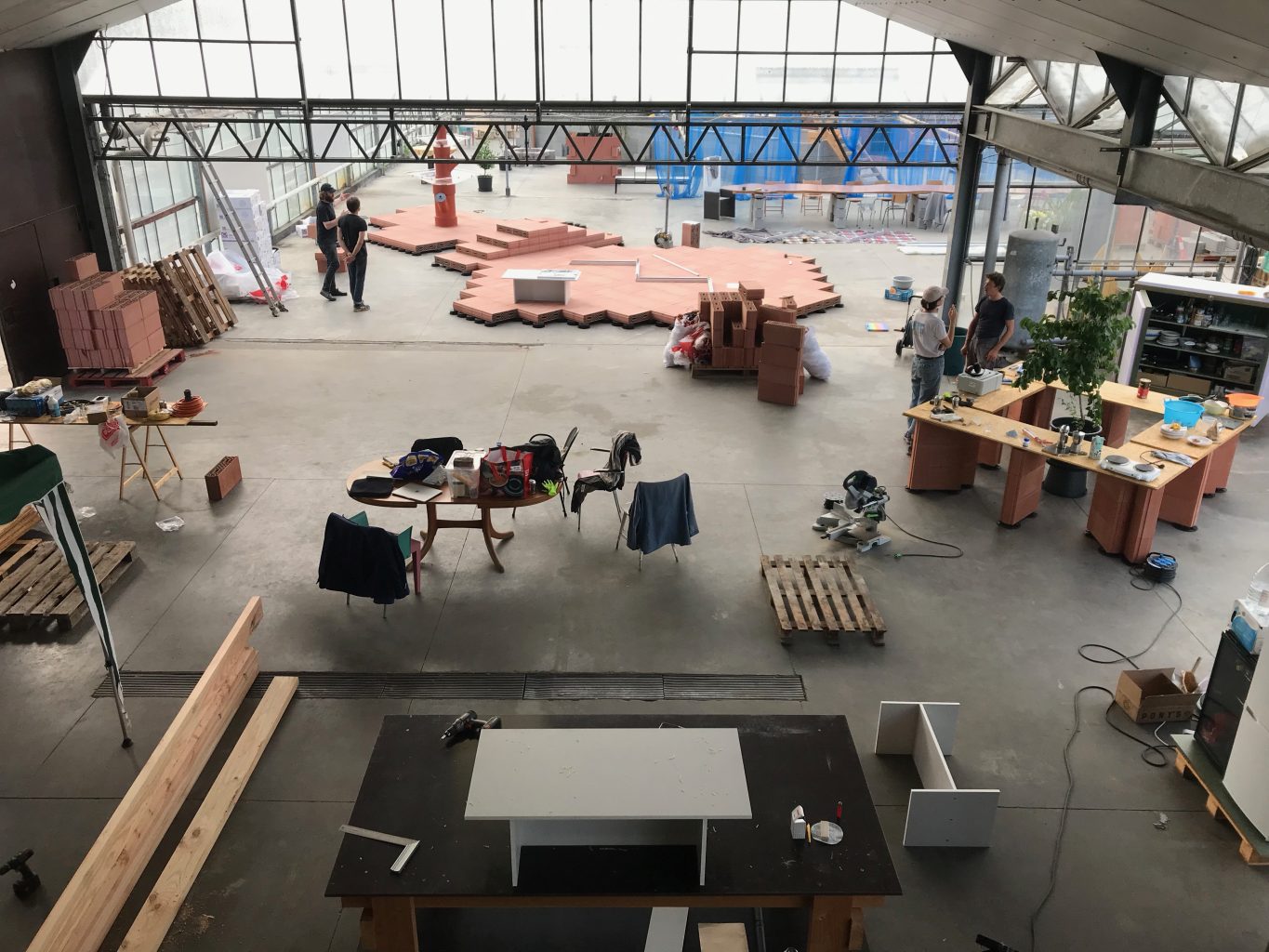
In March 2020, the moment the COVID-19 pandemic arrived in Belgium and its citizens went into a first lockdown, Stefanie Everaert and Theo De Meyer left the city of Ghent and retreated into a large greenhouse, located on the site of a former farm, just outside of the city. The greenhouse was once part of a medium-sized agricultural enterprise, but which could not keep up with the industrialised upscaling of the sector over the past decades and which eventually came to its end. The surrounding fields were leased to other, bigger farmers, but the greenhouse itself was left empty.
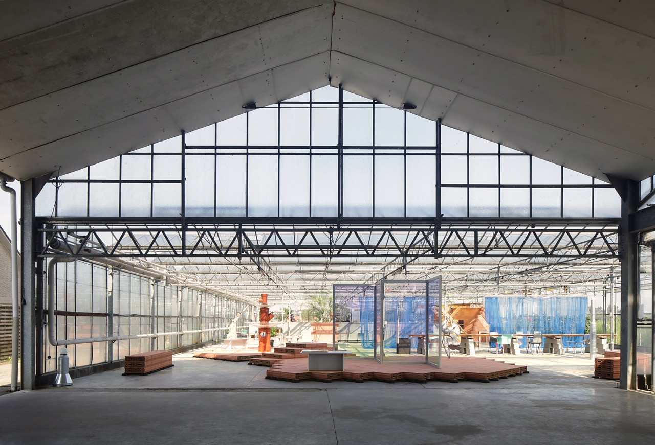
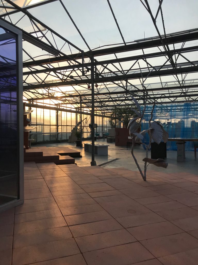
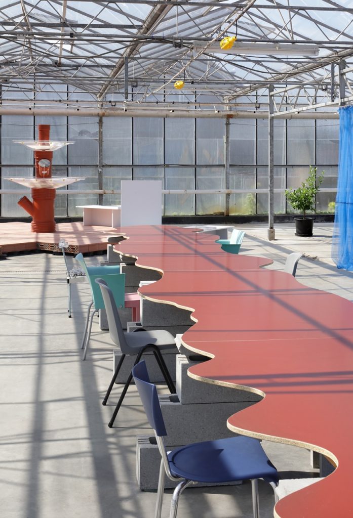
The question of what to do with this ruin of Flanders’ agricultural past, was here answered through a project that became known as Serra. Over the course of two years, Everaert and De Meyer inhabited the space and filled it with a growing constellation of architectural constructions and artistic experiments. Carefully stacked configurations of orange and grey cinder blocks, along with other standardised construction materials, form the basis for the introduction of different functionalities: a tent-like construction was built to house several bedrooms, masonry walls and columns were added to support tabletops and various kitchen appliances, brick flower pots once again allowed for the cultivation of fruits and vegetables, and finally the contours of large basin were constructed, which, perhaps, one day, might be filled with water and serve as a swimming pool. While most of the materials that were used might have come from any hardware store, and as such seem to echo the suburban self-built dreams of many of the surrounding neighbours, the aestheticisation of these materials into carefully arranged configurations lends the whole a rather surreal atmosphere. The best way to describe the place is perhaps as a total interior that houses a miniature city, reminiscent of the large indoor plazas of early twentieth-century shopping malls, of the joyful decors in domed subtropic swimming pools, or even of the fever-dream-like interiors of the more prestigious Las Vegas casinos, where generic versions of European urbanity form the backdrop for games and entertainment.
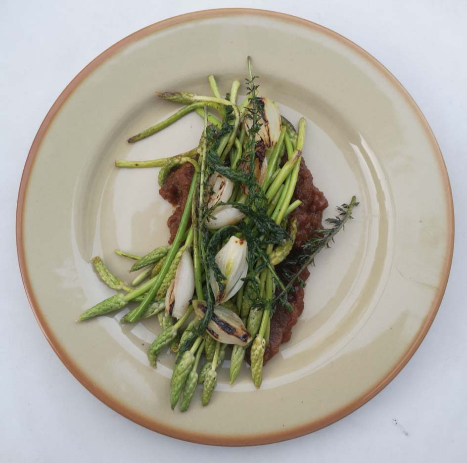
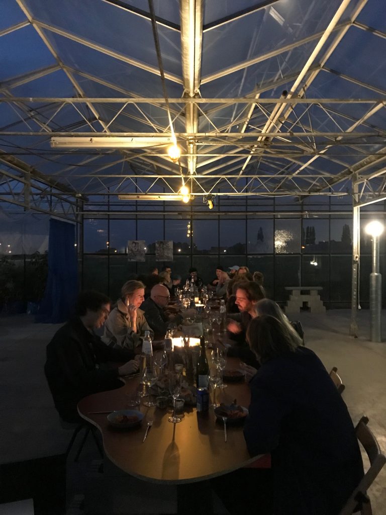
As this construction-site-slash-playground grew, Everaert and De Meyer invited friends and colleagues, architects and artists and students, to visit, to have dinner and to pass by for drinks, and to contribute to this developing work-in-progress. The resulting art installations and various furniture pieces add an additional layer of interventions on top of the initial experiment, reflecting the social process that underlies the whole project. As such, in a time of successive lockdowns and socio-physical-distancing, Serra became a way to slow down, to re-discover the periphery where space could be found again for collective existence, and where the ruins of an agricultural past offered fertile grounds to grow different kinds of produce.
The exhibition I was there to visit was but one of many such collaborations that took place in Serra, but at the same time, it appeared to bring together many of the themes that run through the greenhouse and its surroundings, ranging from the appropriation of technology to the impact of media and the experience of the landscape. Yet, what tied these themes together, and what the title of this essay refers to, was a notion mentioned by De Meyer, who, while showing me around the place, said:
‘I want to talk about kitsch.’
Kitsch
The thing about kitsch is that it is never just kitsch: kitsch is rarely the essence of a thing, but rather a secondary characteristic. It is something additional, that attaches itself to the object, that sticks to it, sticky as the word kitsch itself.
In the precise sense of the word, kitsch refers to the reduction of aesthetic objects or ideas into easily marketable products. In that sense, a lot of twentieth-century modern art, and especially Pop Art, can be seen as the opposite movement: responding to the development of mass consumer culture, it attempted to upgrade easily marketable products into aesthetic objects and ideas.
In a broader sense, kitsch also embodies a certain sentimentality, which is perhaps why it feels so sticky. In his novel The Unbearable Lightness of Being, Milan Kundera writes: ‘Kitsch causes two tears to flow in quick succession. The first tear says: How nice to see children running on the grass! The second tear says: How nice to be moved, together with all mankind, by children running on the grass!’ In this sense, kitsch seems to include a doubling: it is not about the running children themselves, but about the sentiment these running children evoke, and the tendency to generalise – read: market – this sentiment to all of humankind.
This doubling is also mentioned by Susan Sontag in her well-known essay Notes on Camp – a reference that seems inevitable, since the camp aesthetic is perhaps the ironic cousin of kitsch. She writes: ‘Camp sees everything in quotation marks. It’s not a lamp, but a “lamp”; not a woman, but a “woman”.’ In this sense, perhaps, camp is not kitsch, but one step further: “kitsch”.
When De Meyer told me he wanted to talk about kitsch, it was easy to see why, having just arrived through a suburban neighbourhood that barely escapes its own kitschy clichés. But, perhaps even more so when we stood in front of the exhibition itself, titled Arcade.
Arcade
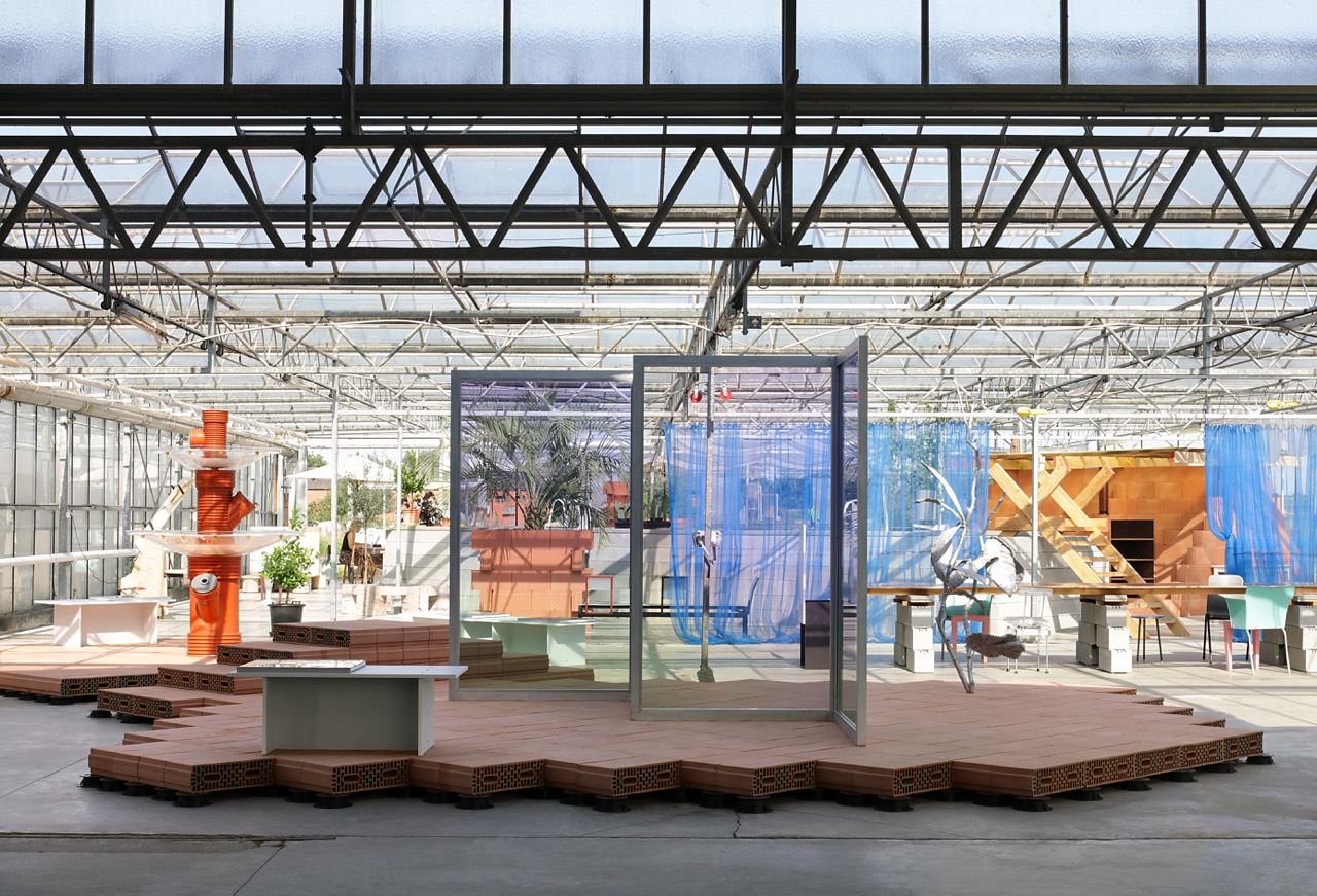
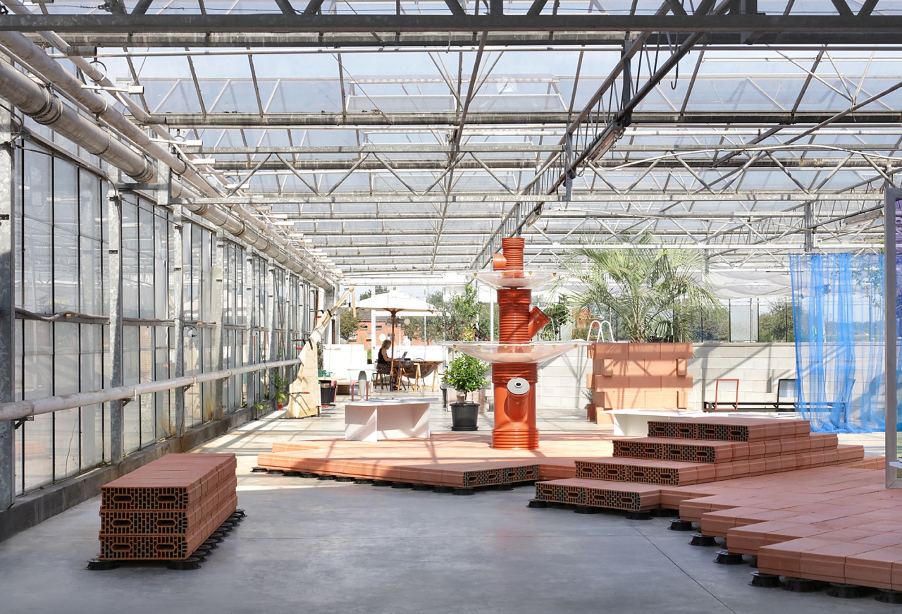
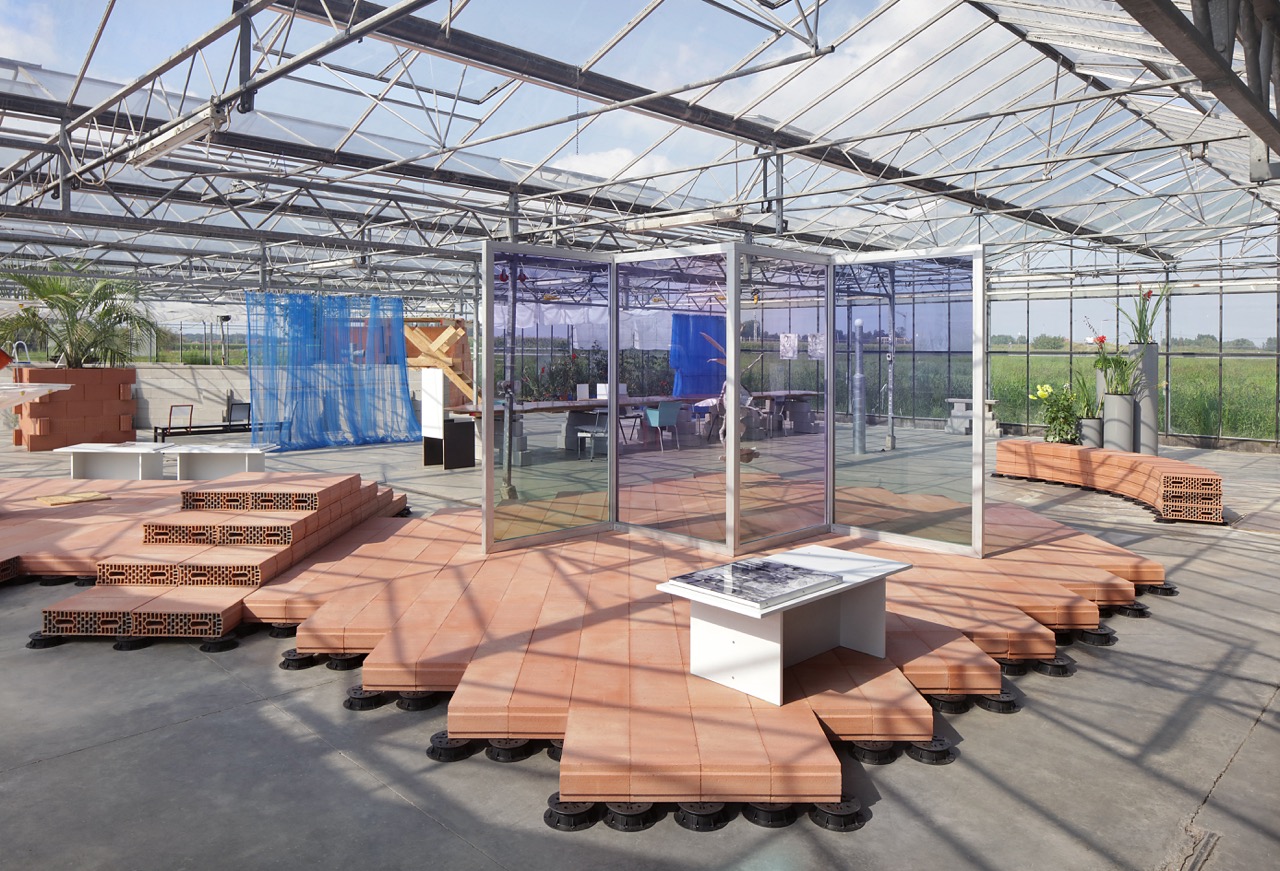
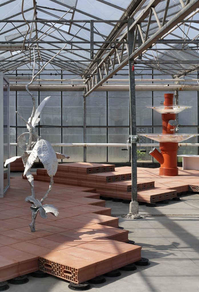
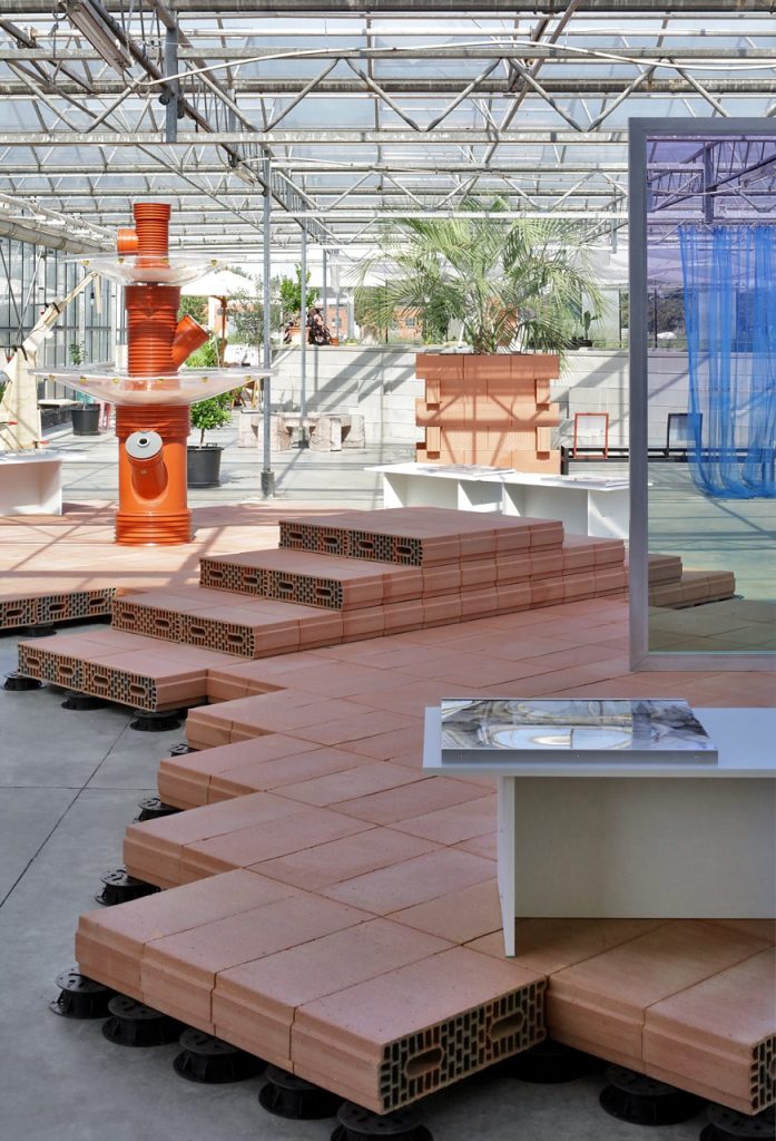
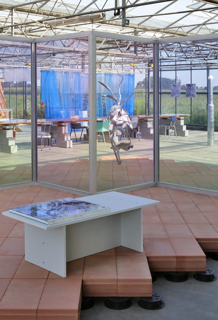
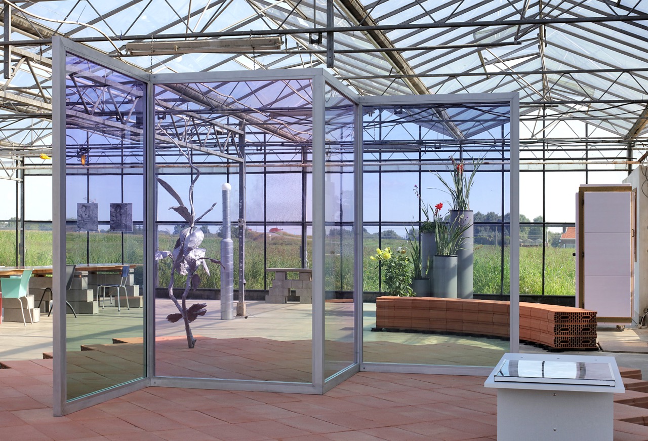
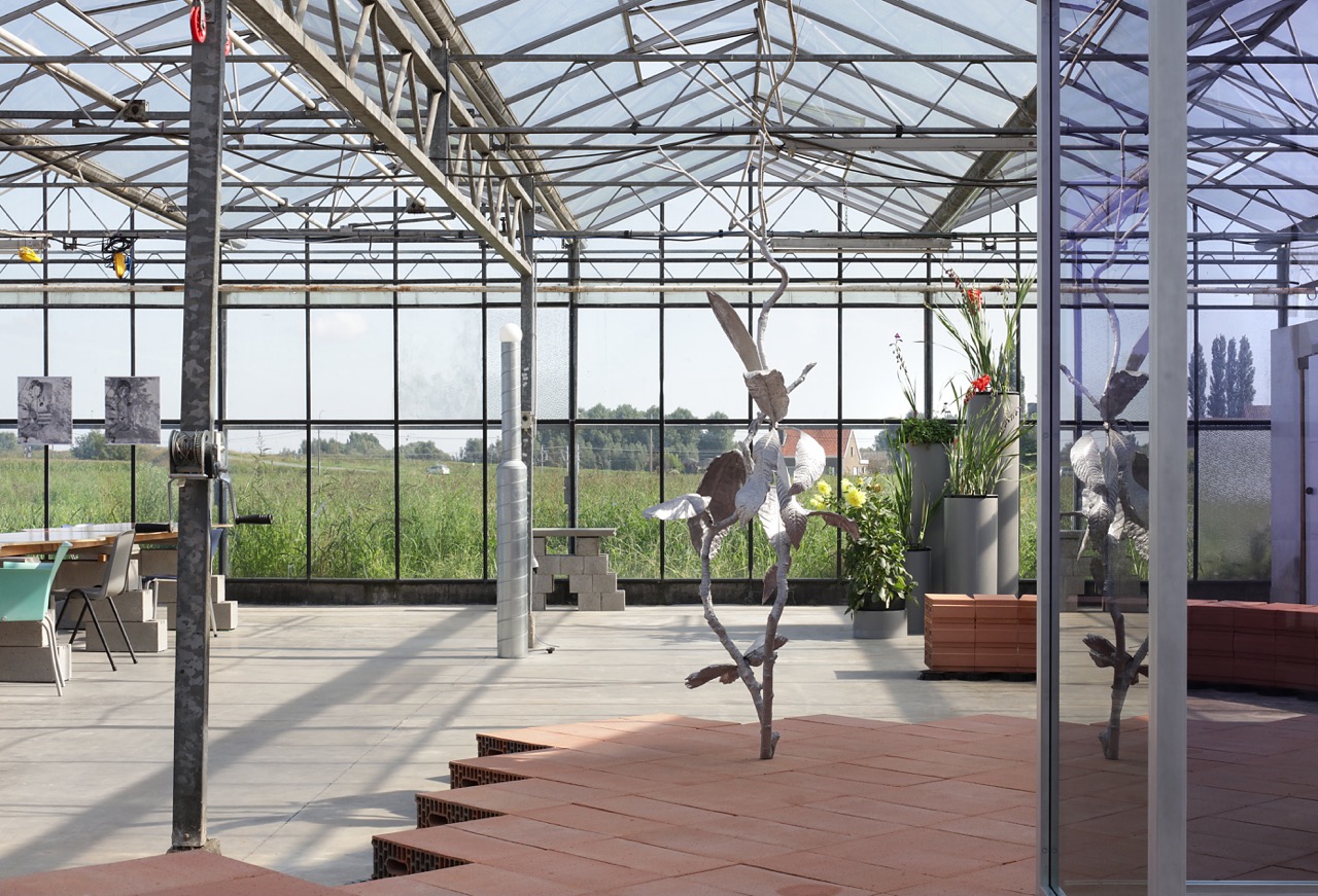
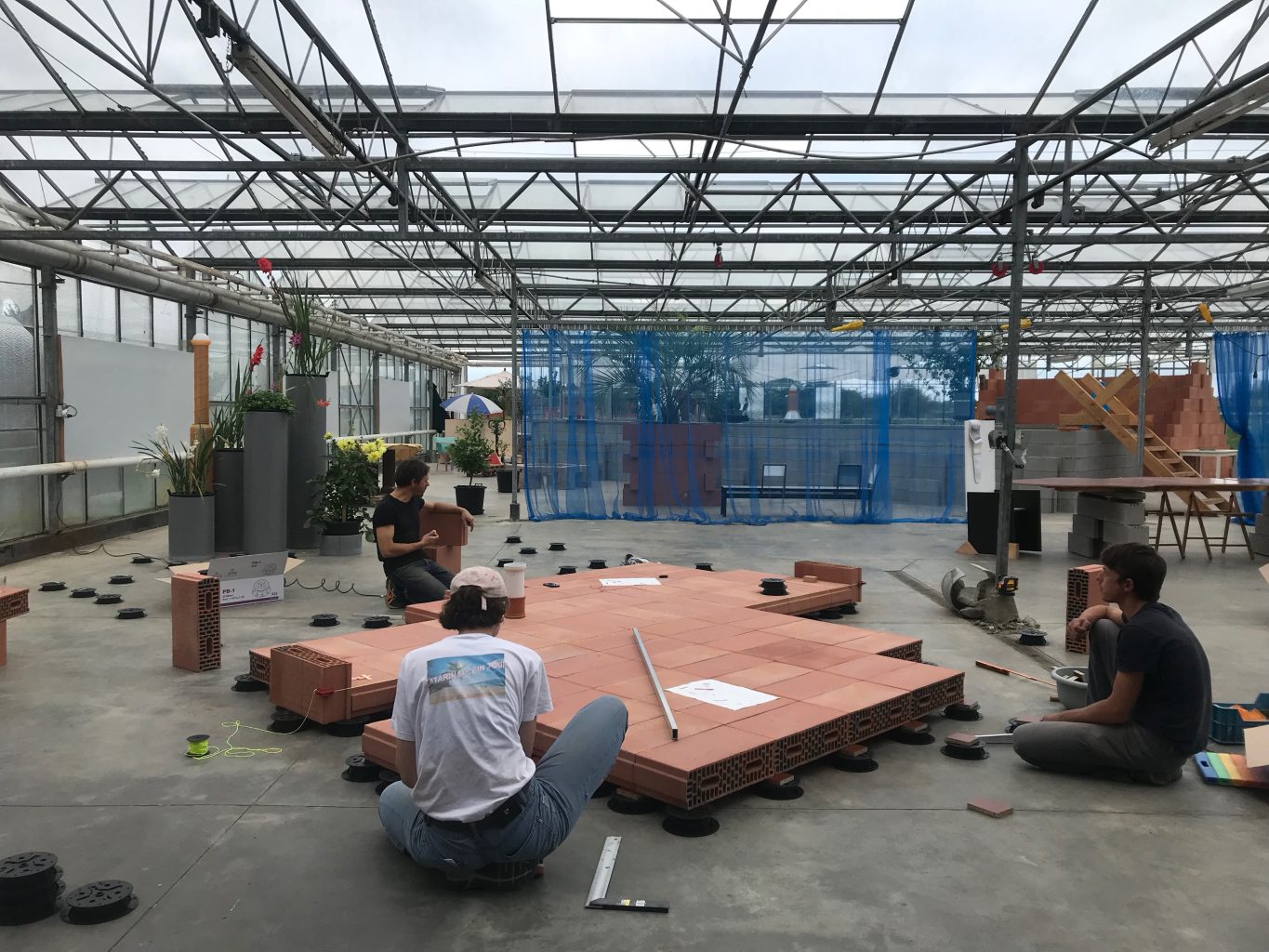
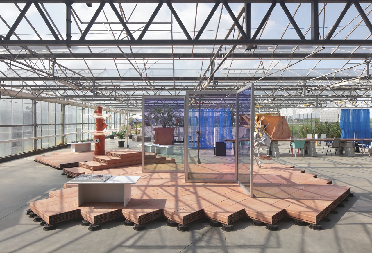
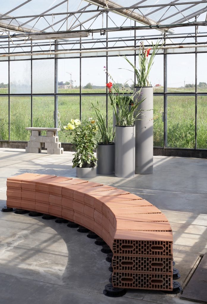
The scenography for the exhibition consisted out of a large podium of stacked cinder blocks, divided into two parts by a rudimentary walkway, as if it was a miniature pond crossed by a footbridge. On the one side, there stood a fountain by Theo De Meyer, while on the other, there was a plant sculpture accompanied by a folded screen of coloured glass by Filip Vervaet, and surrounding these two works, both on and off the podium, stood a number of benches of which the horizontal surfaces displayed black-and-white prints by Manor Grunewald.
It was not directly clear what the title of Arcade referred to in the face of this mise-en-scène, yet at the same time, there were enough implicit associations that made it abundantly clear.
On the one hand, the word ‘arcade’ refers to a space covered with arches, which might be seen to vaguely describe the greenhouse itself, but which more commonly refers to a gallery or colonnade, which can often be found around the courtyards of palaces or monastery gardens. There, the word ‘arcade’ evokes visions of ‘Arcadia’, the mythological image of an innocent, bucolic nature, which the hortus conclusus of many castles and cloisters aimed to simulate, and is faintly echoed in the suburban fantasies of the Flemish countryside as well. Yet, on the other hand, the word ‘arcade’ also evokes associations with games and play, in the sense of an amusement arcade, a venue filled with pop-cultural references and kitschy decors. Within this range of associations, then, staged on a podium of bricks, those three works were displayed.
First of all, the fountain by Theo De Meyer.
De Meyer’s practice operates on the intersection of architectural, interior, and furniture design, and as such is marked by a certain functionality, an apparent preference for standardised solutions and by what seems like a common sense derived from the pragmatic organisation of construction sites – but which results in designs and installations that ambiguously escape all of the above.
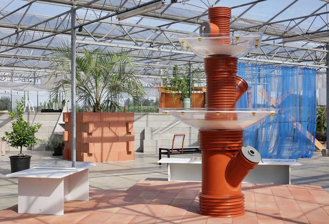
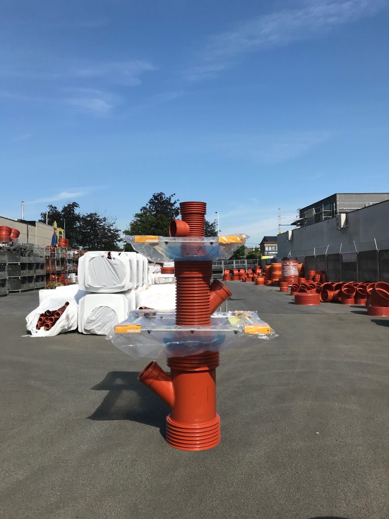
This fountain was no exception. It was a simple and functional construction made out of three standard sewer pipes, stacked on top of each other in decreasing sizes, as to make a small tower. In between the pipes, two square yet bulbous skylights were inserted upside-down, to function as water basins that catch the water flowing from a faucet at the top and which streams all the way down before being pumped up again.
The result is a classical, almost stereotypical fountain, the type of fountain that might be found in our imagination of generic Italian town squares, where the sound of clattering water fills the deserted streets of a sleepy village. Yet, while the countless plaster reproductions of such Picturesque fountains, often found at garden centres and decoration stores, still make a pretence of being the real thing, the construction of this fountain, in such ordinary materials, drops any attempt at romanticising and instead celebrates its composition of industrialised parts. If kitsch is the reduction of aesthetic objects or ideas into easily marketable products, De Meyer’s fountain rather uses cheap and marketable elements to upgrade the generic fountain archetype into an aesthetic object.
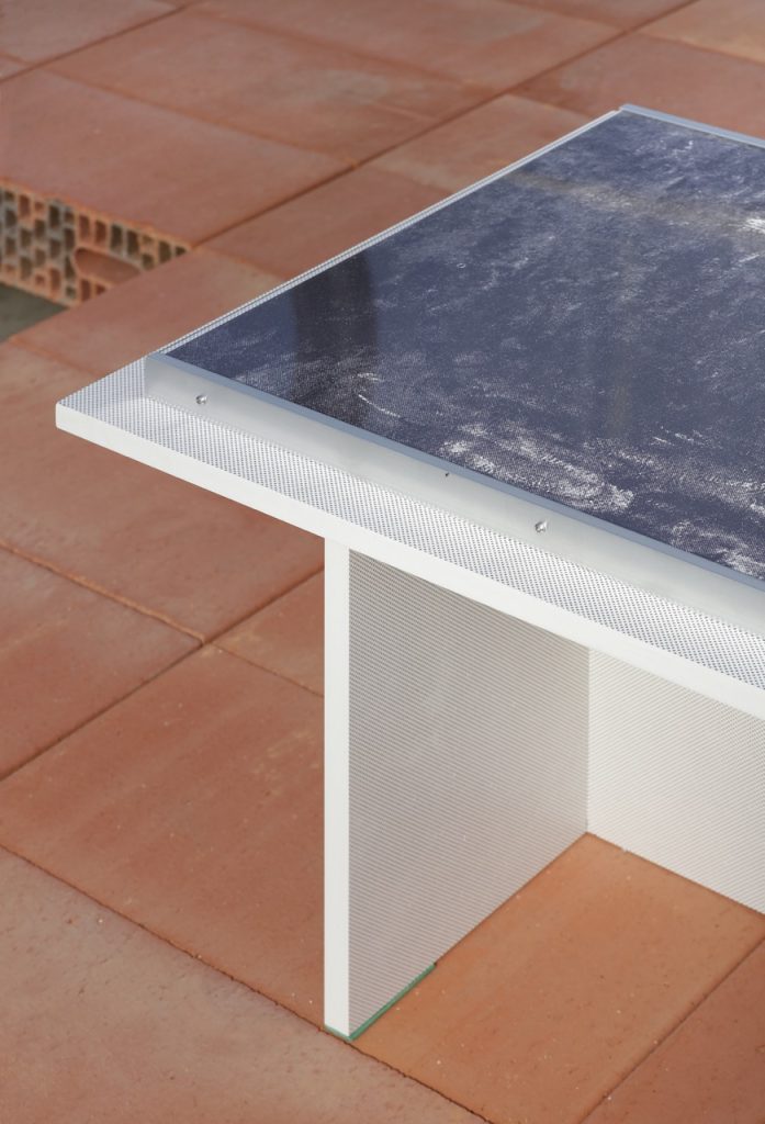
Secondly, there were the metal benches showing the black-and-white prints by Manor Grunewald.
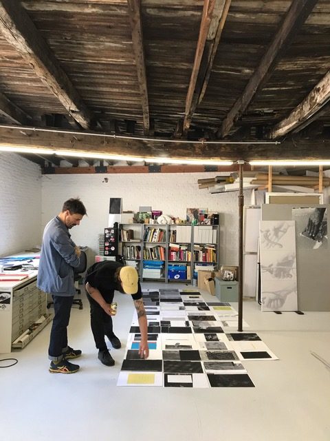
In general, Grunewald’s work often addresses the procedures of image-making and mediation that shape our perception of the world, leading him to explore the boundaries of such media by dis-assembling and re-assembling the formats through which they operate. As such, the benches are made out of PVC foam boards, which are generally used for large advertisement displays, yet here they are used in simple assemblies, which can be read as an abstraction of the type of robust benches, picnic tables, hiking signs and info panels one finds in nature reserves and forests, yearly overwhelmed by tourists.
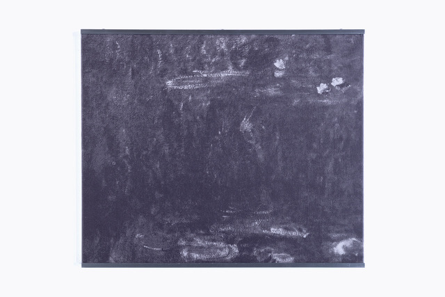
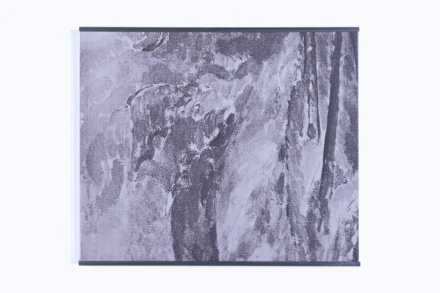
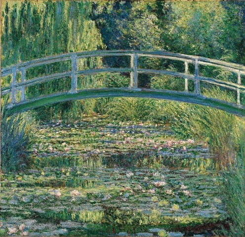
The black-and-white images printed on top of these benches show adaptations of Monet’s colourful impressionistic paintings which, in the nineteenth century, might have once appeared as radical visions of the world, yet by now, today, have become stuck in our collective memory as generic, slightly idealising views of nature, and of which endless reproductions adorn the interiors of hotel lobbies and restaurant dining rooms. The method of abstraction through which these images are shown estranges them from the cultural clichés in which they seem to be frozen, and empties them from the accumulated sentimental associations they have acquired over the years.
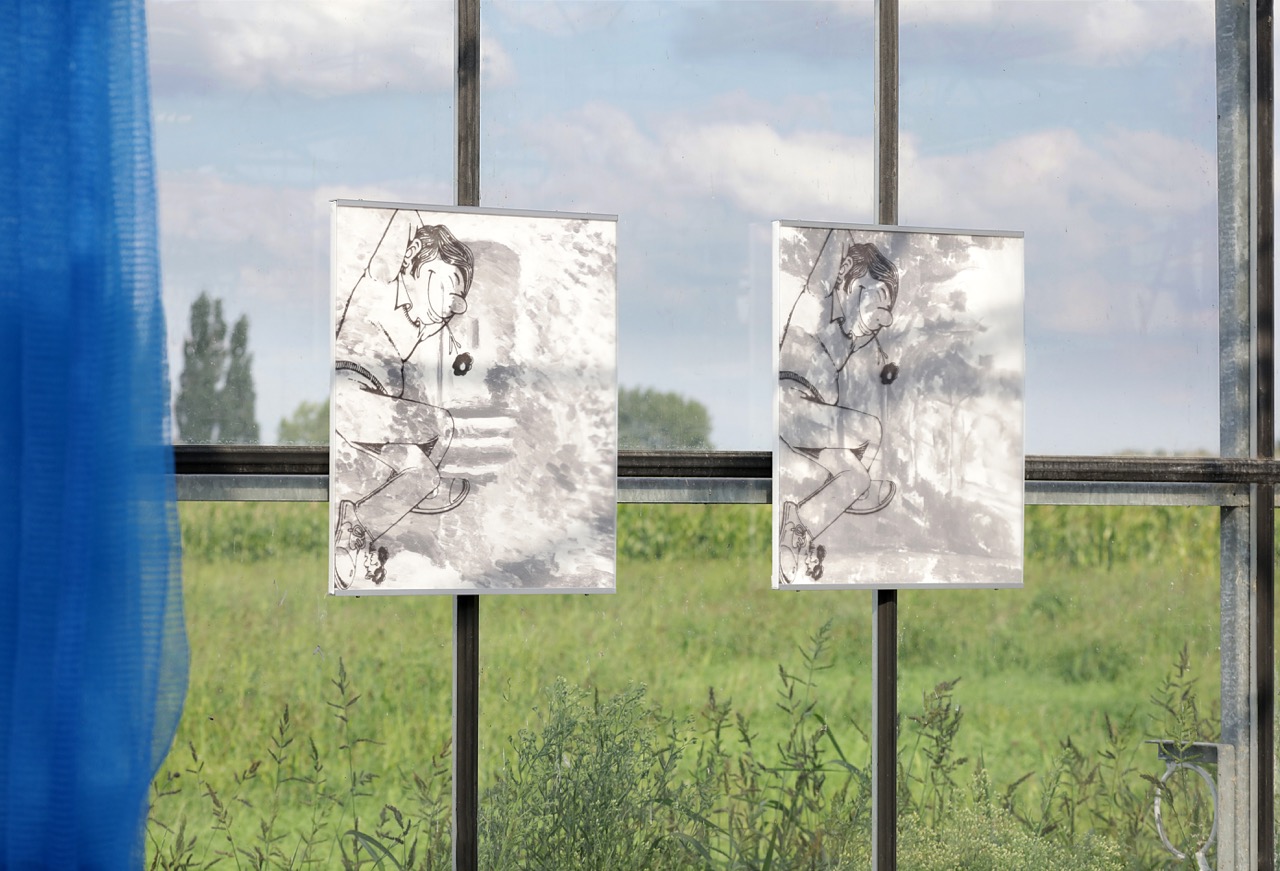
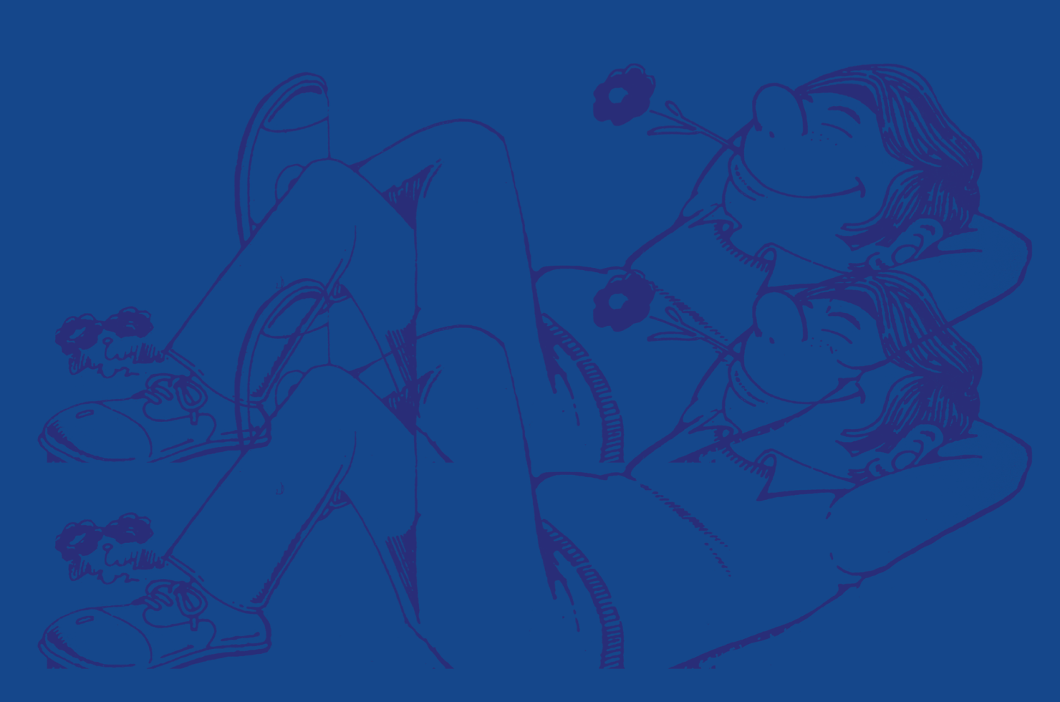
In addition to these prints, however, and a little to the side of the general installation of the exhibition, Grunewald also hung two smaller prints against the windows of the greenhouse, some twenty centimetres apart from each other. Both prints consist of a layering of two black-and-white images: in the first one, we see a blurry painting of a stone tower surrounded by dense foliage overprinted with the sideways image of a cartoon figure lying in the grass, arms behind their head and a flower hanging from their mouth. In the other one, we see an equally blurry painting of a line of trees within a rural landscape, overprinted with the same cartoon figure. Instead of the abstraction of the other prints, here, the gesture of overlaying both these seemingly Picturesque paintings with a cartoonish figure expressing some kind of general idea of leisure and free time appears as an attempt to render the sentimentality of the underlying scenes explicit. Moreover, the gap of twenty centimetres between both prints frames the view onto a small farm in the distance, beyond the green field surrounding the greenhouse, which, as a result, directly projects this sentimentality back into the actual countryside. In doing so, the prints confront whatever Romantic associations may arise in the mind of the viewer with the reality of it. Taken together, the prints of Grunewald seem to disrupt the usual way of looking at countryside, both in representation and in reality, opening up a space to look at the world anew.
Finally, there was the plant sculpture alongside the folded screen by Filip Vervaet.
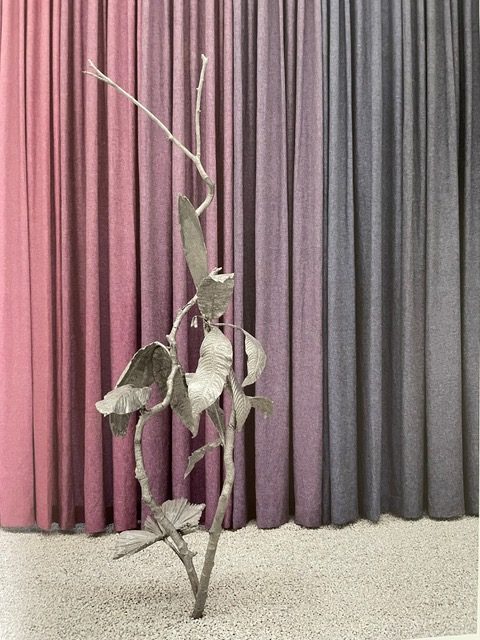
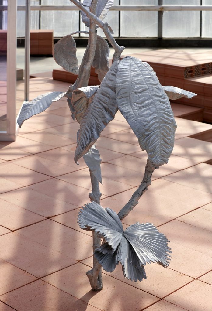
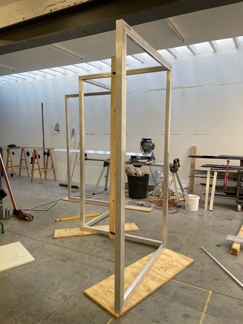
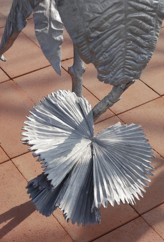
Vervaet’s work has often been described as dealing with the supernatural and the subconscious, questioning our sense of reality. Here, at Arcade, Vervaet focused primarily on the supernatural, while suggesting that there might not even be such a thing as the natural. The sculpture is a plant of some sorts, cast in iron, and composed as a large forking branch that grows upwards, prominently carrying its leaves. Upon closer inspection, the visitor notices that the leaves are derived from different, and perhaps non-existent or other-wordly plants. It is a compound plant, a vegetal assembly, an artificially constructed species that might exist in our human dreams of a genetically-engineered future, or perhaps in an alternate timeline where the Darwinian process of natural selection ran a different course – which it still might. The accompanying screen with its panels of coloured glass, a vertical yellow-blue gradient, further enhances the estrangement at work in the sculpture by framing the object in different hues and perspectives, depending on the standpoint of the viewer. As such, the presence of this alien plant species seemed to challenge the notion of a stable and fixed nature and instead emphasised the constructedness of the natural world, not only by human beings, which in the monocultures of this semi-urban-industrio-rural landscape of Flanders was difficult to escape, but also by itself, through the potentially infinite, ever-changing process of natural differentiation. While the plant sculpture evoked the image of an unnatural construction, it is unnatural precisely because of the speculative logic that underlies nature itself. With its incessant variation and evolution, nature is never natural: it is not a plant, but a “plant”; it is not nature, but “nature”.
While each of these three works dealt with different yet overlapping themes – the détournement of industrialised standardisation, the questioning of collective and mediated frames of reference, and the supernatural nature of nature – it is in the specific treatment of their various subjects that they nonetheless related to each other. The upgrading of marketable products into aesthetic objects, the sentimentality that either disappears or is rendered explicit, and the displacement of the natural world into quotation marks are all variations of and plays on the logic of kitsch, which, in contrast to its suppression by twentieth-century modern art, here became an aesthetic strategy to ground these larger themes into specific, tangible works.
*
After my visit to the greenhouse, under the orange light of a sun about to set, I walked back to the train station the same way I had come: over the stretch of long and winding country road, along which the stand-alone, single-family houses still stood side by side, on their respective, delineated, distanced, distinguished plots. The buzzing sound of the robotic lawn mowers had disappeared, as if their shift had collectively come to an end, but the rest of the garden decorations still inhabited the succession of front lawns. It was not too hard to imagine, in between the trimmed hedges, the flower beds, the miniature ponds and plaster statues of Greek goddesses, the presence of an archetypical fountain made of sewer pipes, or a metal bench overlooking a pond, or even the sculpture of an alien plant species on a patch of empty gravel, as if the questions on technology and standardisation, on media and history, and on nature and artifice, were not merely a matter of art exhibitions, but were equally relevant for the front lawns of a suburban neighbourhood sprawling through the countryside.